Here is how Samsung’s One UI user interface makes their phones the best Android phones around
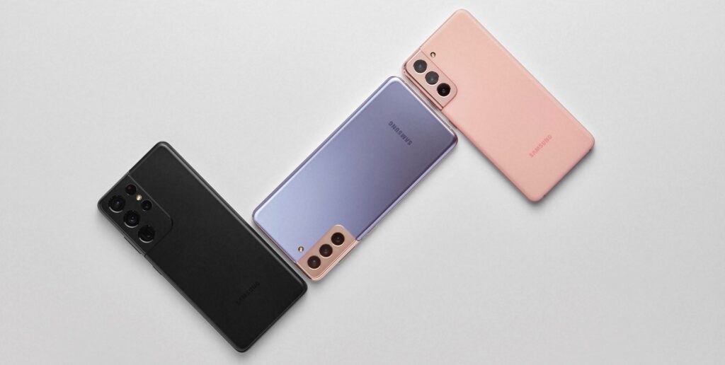
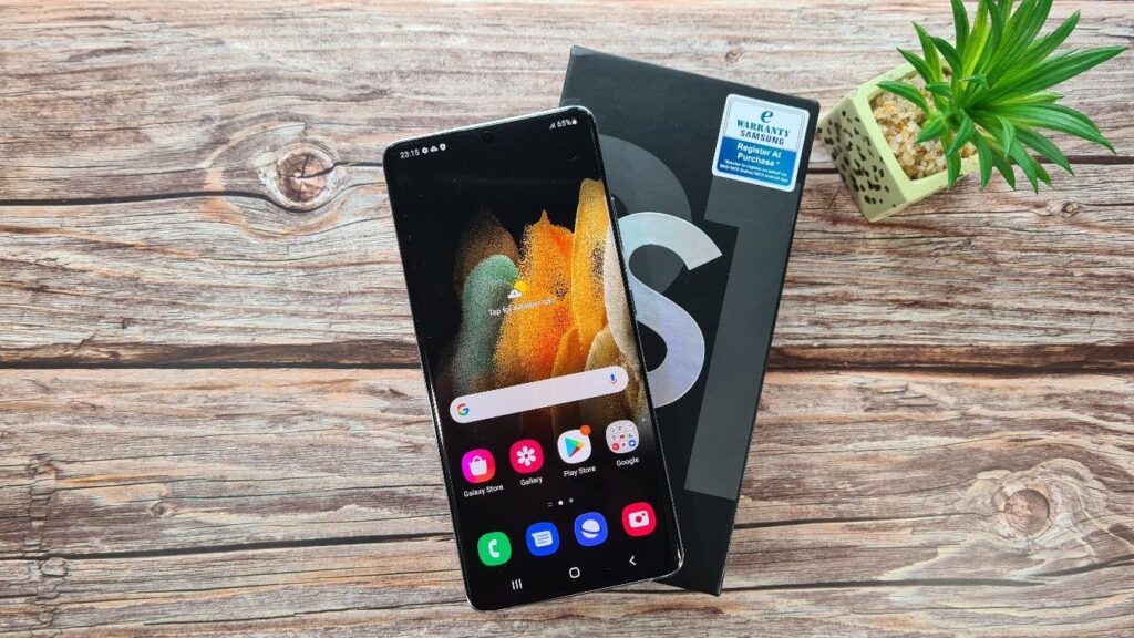
Samsung’s latest Galaxy S21 series phones are currently among the best phones that money can currently buy in 2021 but it’s not just the impressive specifications powering them that make them so desirable. They’re already making the rounds in Malaysia and we’ve just tested their most powerful offering, the Galaxy S21 Ultra.
The secret sauce that makes Samsung’s Galaxy series phones different and powerful goes beyond mere hardware alone, it’s their user interface that they’ve dubbed One UI which powers their latest phones from the new Galaxy S21 series on down.
First unveiled in November 2018, Samsung’s One UI is the successor to their TouchWiz user interface that last ran on their older devices which have since passed into history like the venerable Galaxy S7. Here’s what makes the new One UI user interface, now updated to version 3.1 so special.
What is One UI about
A lot goes into the concept and design of a user interface for a phone, more so a chart-topping flagship phone like the Galaxy series.
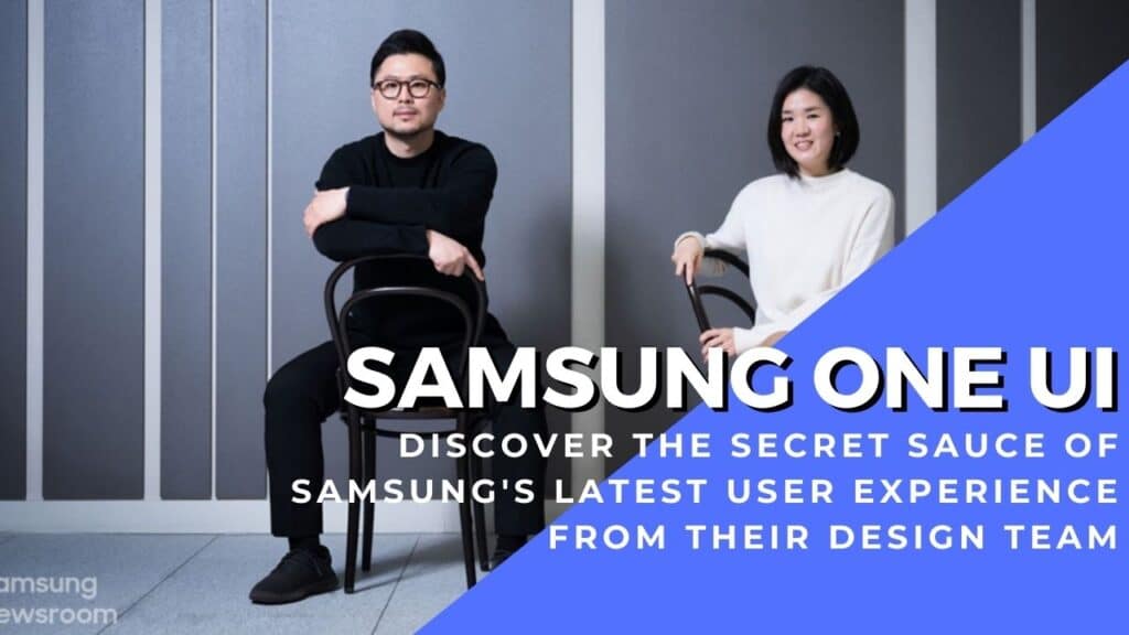
Two members of the design team from Samsung Electronics, Mr. Jeoggun Choi, Principal UX Designer in the Core UX Group, Mobile Communications Business and Ms. Min-Young Chang, Principal UX Designed in the UX Design 2 Group, Mobile Communication Business shared more about the four core principles that guided One UI’s design and implementation. They are –
-Focus on the task at hand
-Interact Naturally
-Be comfortable to view
-Make things responsive
Of the four principles, the last one, ‘Make Things Responsive’ was the latest addition to the design tenets of One UI that was introduced with the creation of One UI 3.1
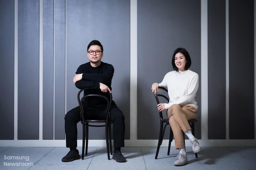
Mr. Jeoggun Choi, Principal UX Designer in the Core UX Group, Mobile Communications Business and Ms. Min-Young Chang, Principal UX Designed in the UX Design 2 Group, Mobile Communication Business, Samsung Electronics.
“From tablets to foldable phones and regular smartphones, the types of devices people are using has diversified, and the number of features and functions has also increased,” said Principal UX Designer Jeonggun Choi.
“Following this trend, new principles were needed to provide the best layout for our users.” Whether an app is running on the Galaxy S21, Galaxy Tab, or the foldable Galaxy Z series, the UI is optimised for each device.
The key takeaway here is that one size doesn’t fit all and that the user interface for a phone or tablet needs to be designed so that it optimises and makes full use of the space available in the best way possible.
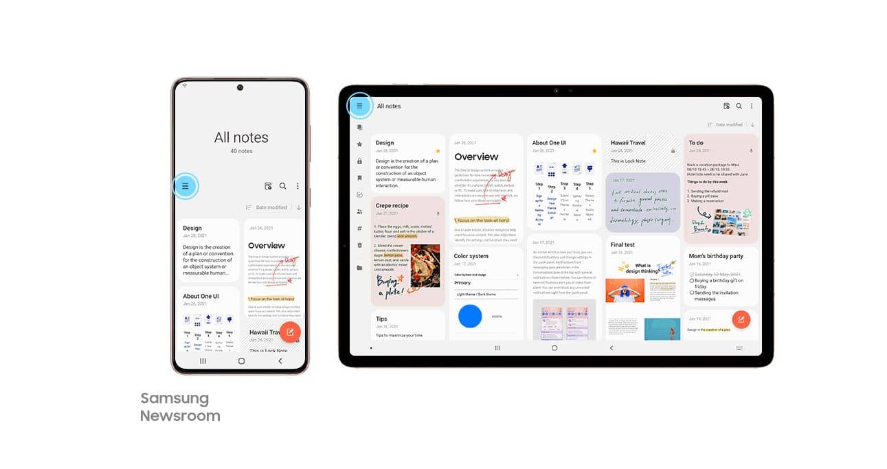
When using the Samsung Notes app on a phone with a standard (circa 5-inch to 6-inch) display, users can access the app menu by pressing the navigation button at the top left side of the screen. But on the Galaxy Z Fold and Tab series, users can take advantage of the larger display by having the entire menu always in view, without having to press anything which makes the use of a foldable device or a tablet even more tempting for power users.
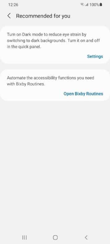
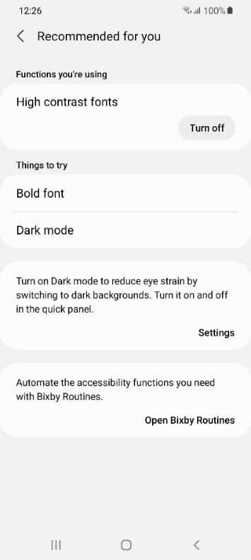
Additional improvements in regards to One UI’s fourth principle also include recommended high contrast fonts, bolded fonts or dark mode if a Galaxy phone user has impaired vision while ensuring all accessibility features are all located in one single screen for easy access.
“Accessibility features are so diverse that it can often be difficult to use them to their full potential,” said Jeonggun Choi. “The ‘Recommended for you’ function increases convenience and helps users get more out of those features by identifying and recommending ones that users may need. We’ve also made it easy to use these features only when needed by allowing users to turn the features on and off while in use on one page.”
Effortless connectivity within the Galaxy ecosystem of devices with One UI
Table of Contents
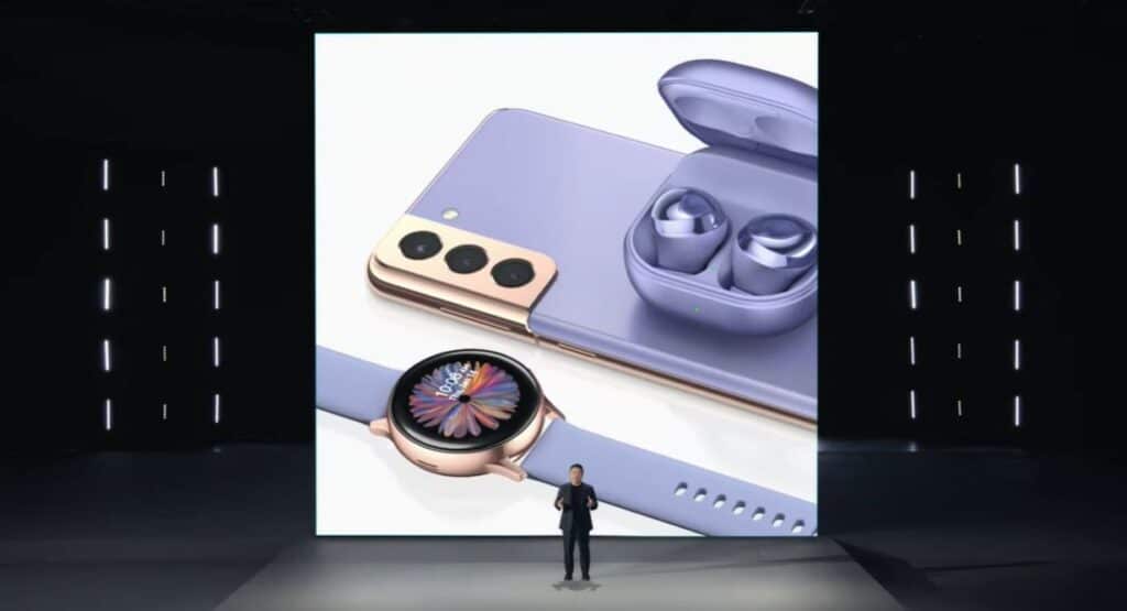
One of the pet peeves that has been exacerbated by recent times is that connectivity isn’t guaranteed between devices and even if so, it’s often a haphazard effort that’s prone to browning out at inopportune moments or which has been poorly optimised such as when attempting to pair a phone to a TV or swapping headphones from a tablet to your phone. One UI 3 addresses all these issues and allows for a more seamless connected device experience.
“A new feature called ‘Continue apps on other devices’ has been added so that users can continue whatever they were doing on their smartphone – whether browsing a web page or working on a draft in Samsung Notes – on their tablet,” said Principal UX Designer Min-Young Chang. “Users can also copy text on their smartphone and paste it onto their tablet.”
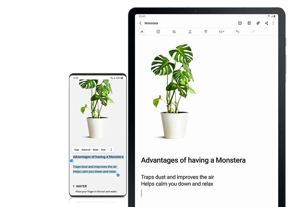
This adds additional advantages to using a tablet, especially a Galaxy Tab slate like the Tab S7. The aforementioned easy switching of Galaxy Buds series earbuds is achieved via their Auto Switch feature, enabling users to swap the active pairing to whichever device is playing media assuming that the paired devices both run One UI 3.1 and are paired to the same Samsung user account and WiFi network.
One UI 3 also enables users to stream content or video calls from their phones straight to a Samsung TV without any fiddly tinkering with settings with their Smart View mode. “Starting with the One UI 3.1 update, users can cast their Google Duo video calls onto their TV with one just click,” said Jeonggun Choi. “With an increasing number of people connecting with their family via video calls and conducting virtual work meetings, this is an especially useful feature.”

One UI – Customisable experiences to suit users
Seeing as phones are stuck to us for the better part of the day from the moment we wake up well till sundown and likely beyond that, it’s a given that we want to customise them to better suit our personalities and needs.
“We have implemented a diverse array of features to let users use their smartphone as a form of self-expression,” said Jeonggun Choi. “Users can enjoy a customized Galaxy experience by choosing a video as the incoming and outgoing call screen or changing the wallpaper in the Messages app.”
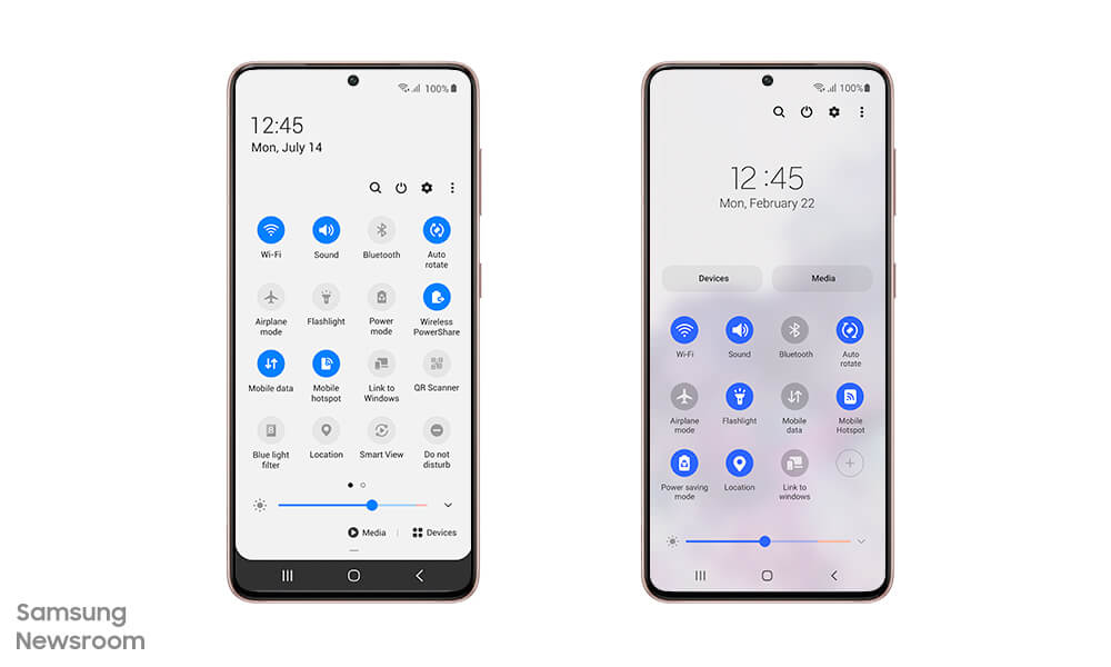
“We first analyzed the usage for each feature available in previous models,” said Min-Young Chang. “After ranking the features based on their popularity, we placed the most used features at the top while hiding the least used features to simplify the panel.”
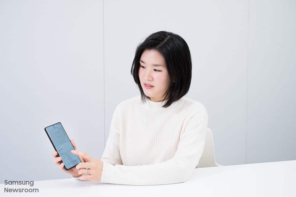
Ms. Min-Young Chang, Principal UX Designed in the UX Design 2 Group, Mobile Communication Business, Samsung Electronics
Saving time second by second
Every second matters and a moment saved is a moment earned. One of the key updates in One UI 3.1 is more seamless integration of the Clock app with Samsung’s Bedtime mode in their Wellbeing app. Users don’t have to swap between either app to set their sleep and wake alarms which saves a few precious seconds.
“Users might not be aware of all of the One UI design updates that have been made but these improvements combined help users recognize and react to various features quicker and in a more direct manner. Even if it saves 1 to 2 seconds of user’s time, I think it would have been worth the effort,” said Jeonggun Choi. “The One UI designers are going to continue coming up with designs that elevate our users’ happiness and satisfaction with Galaxy devices.”
The One UI 3.1 user interface – redefining experiences
Currently, the latest version as of 2021 is One UI version 3.1 powering their Galaxy S21 series phones and which is currently being pushed to their Galaxy S20 series and Note20 series phones as well as their older Galaxy S10 series phones and Note10 series down the line.
The One UI update is being gradually pushed to these older phones from February 19th onwards though what we’ve seen so far is that many of these older devices have been upgraded to One UI 3.0 which has most, if not all of the benefits of One UI 3.1.
You can find out about which exact phones get the One UI 3.1 update in our prior feature here. You can also check out our review of Samsung’s most powerful phone as of early 2021, the Galaxy S21 Ultra here. To acquire the Galaxy S21 series phones, you can check out the official Samsung Malaysia online store here.
