Samsung showcases the power of their new One UI user interface
Smartphones today aren’t just a matter of plonking in the best hardware available to attain primacy. You need the software to run it and run it in a fashion that won’t have you racking your head just to navigate the menus to get it to do what you want. Samsung’s lead in making large-sized phones like the Galaxy Note series has resulted in a series of innovations, with their latest user interface, dubbed One UI designed to be their most streamlined and efficient UI yet.
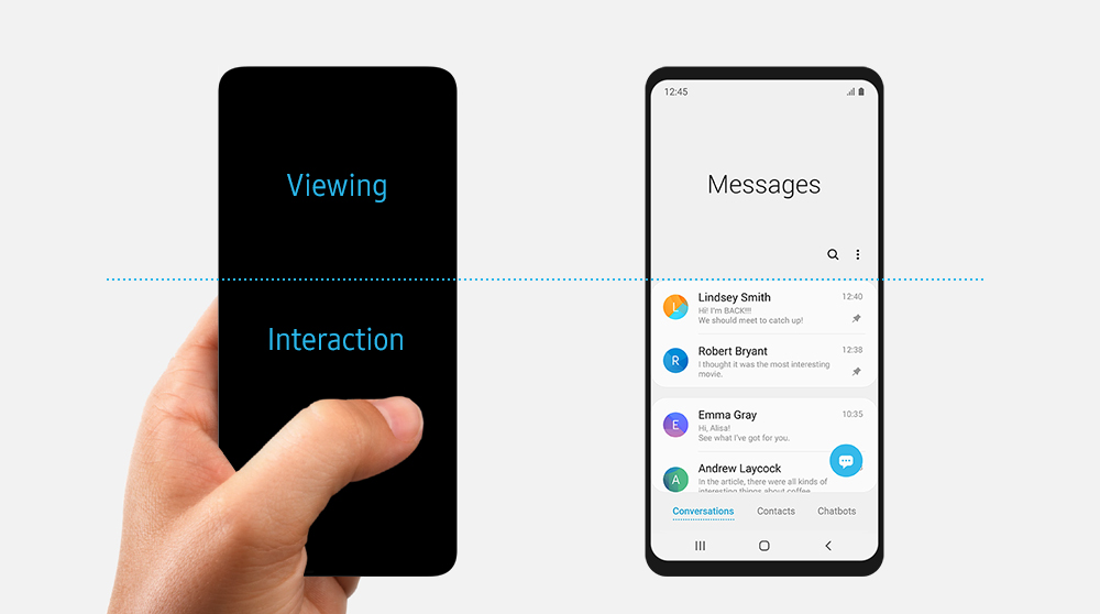
One UI rethinks a few dynamics of how we use large-sized phones. Now, it splits the top half to view content while the bottom has buttons, menus and the like for you to interact efficiently with said content. This makes it a darned lot easier than having to independently fire up split screen view every time you need to multitask.

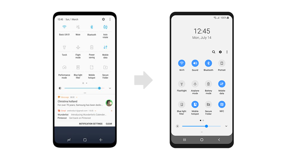
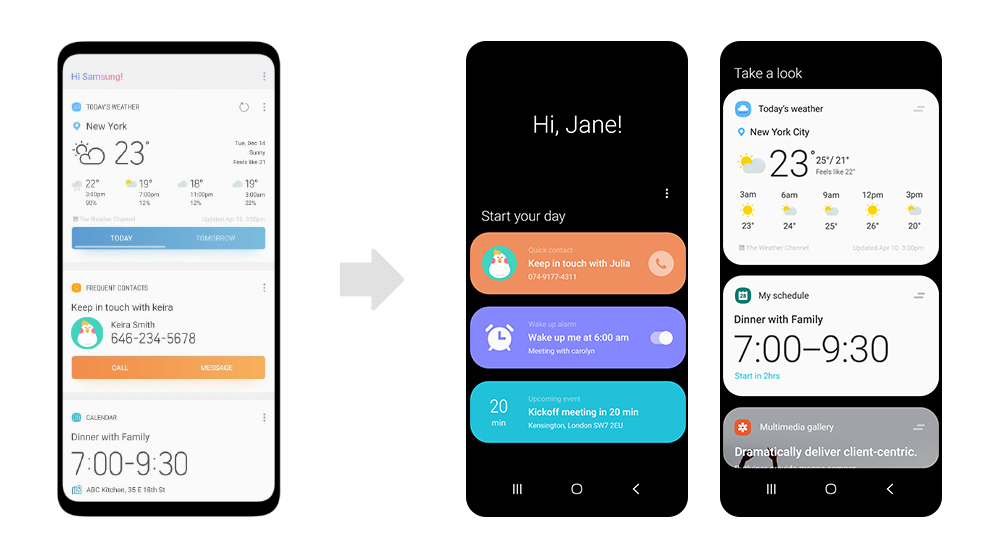
Another innovation is that they’ve made the whole menu simpler with a minimalist design and ‘focus blocks’ that create chunks of data that you can comfortably process with your eyes at a glance. This extends to opening apps as context appropriate controls and info are display only for the relevant task at hand rather than deluging you with a tidal wave of information.
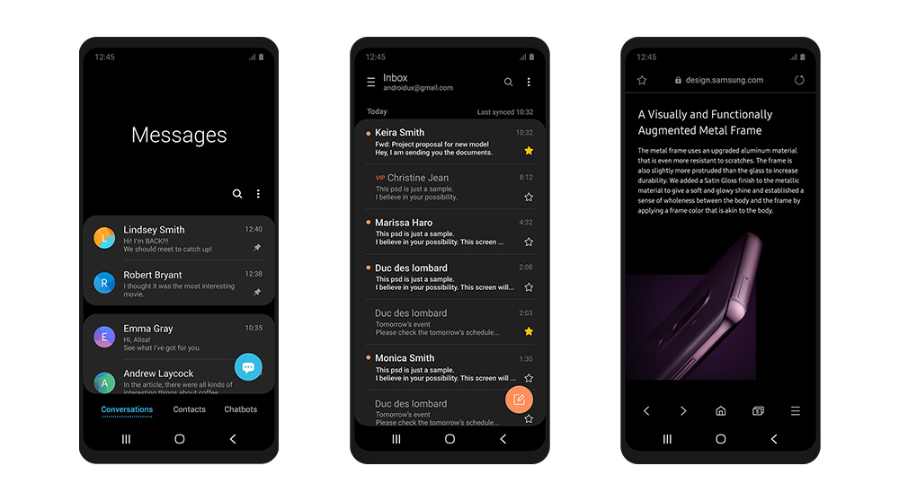
One particularly welcome innovation with One UI is a new Night Mode that makes the screen mostly dark and makes it easier to read, especially after sundown. Better yet, this also saves on juice as the phone needn’t have to keep the whole display on.

At present in Malaysia, One UI is being issued to the Galaxy S9 and S9+ as an OTA update with other phones to follow soon. Have you played with One UI yet? Tell us what you think!
